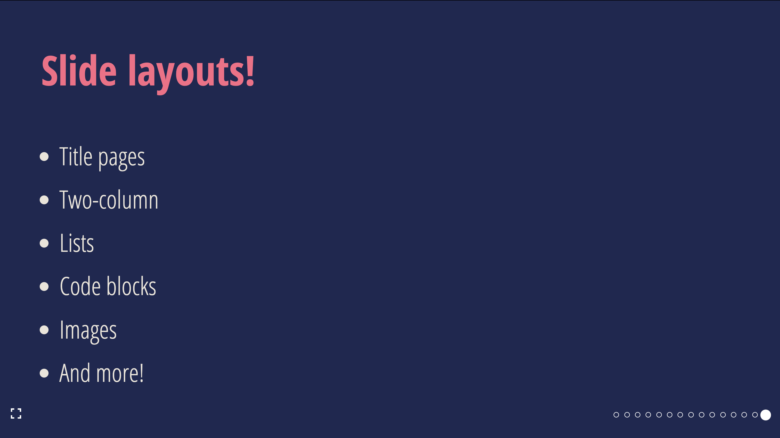
React Slide Layouts
SlideLayout
SlideLayout is a set of helper components used to create slides from a set of pre-defined layouts, so you can avoid dealing with things like layout primitives.
SlideLayout.Full
A full-slide layout
| Props | Type | Example |
|---|---|---|
...slideProps | Slide Props |
SlideLayout.Center
A layout with centered content
| Props | Type | Example |
|---|---|---|
...slideProps | Slide Props |
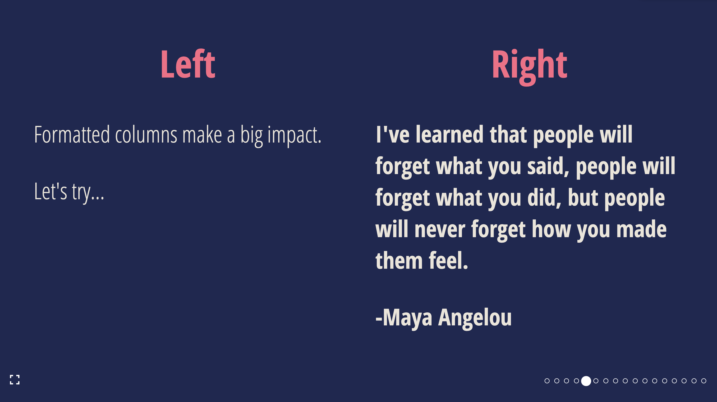
SlideLayout.TwoColumn
A layout with two columns
| Props | Type | Example |
|---|---|---|
...slideProps | Slide Props | |
left | ReactNode | <Heading>Left</Heading> |
right | ReactNode | <Heading>Right</Heading> |
SlideLayout.List
A layout with a list and an optional title
| Props | Type | Required | Example |
|---|---|---|---|
...slideProps | Slide Props | ❌ | |
items | ReactNode[] | ✅ | ['Hello', <Text>World</Text>] |
title | string | ❌ | My list slide |
titleProps | Heading Props | ❌ | { color: 'red' } |
animateListItems | boolean | ❌ | true |
listProps | List Props | ❌ | { backgroundColor: 'purple' } |
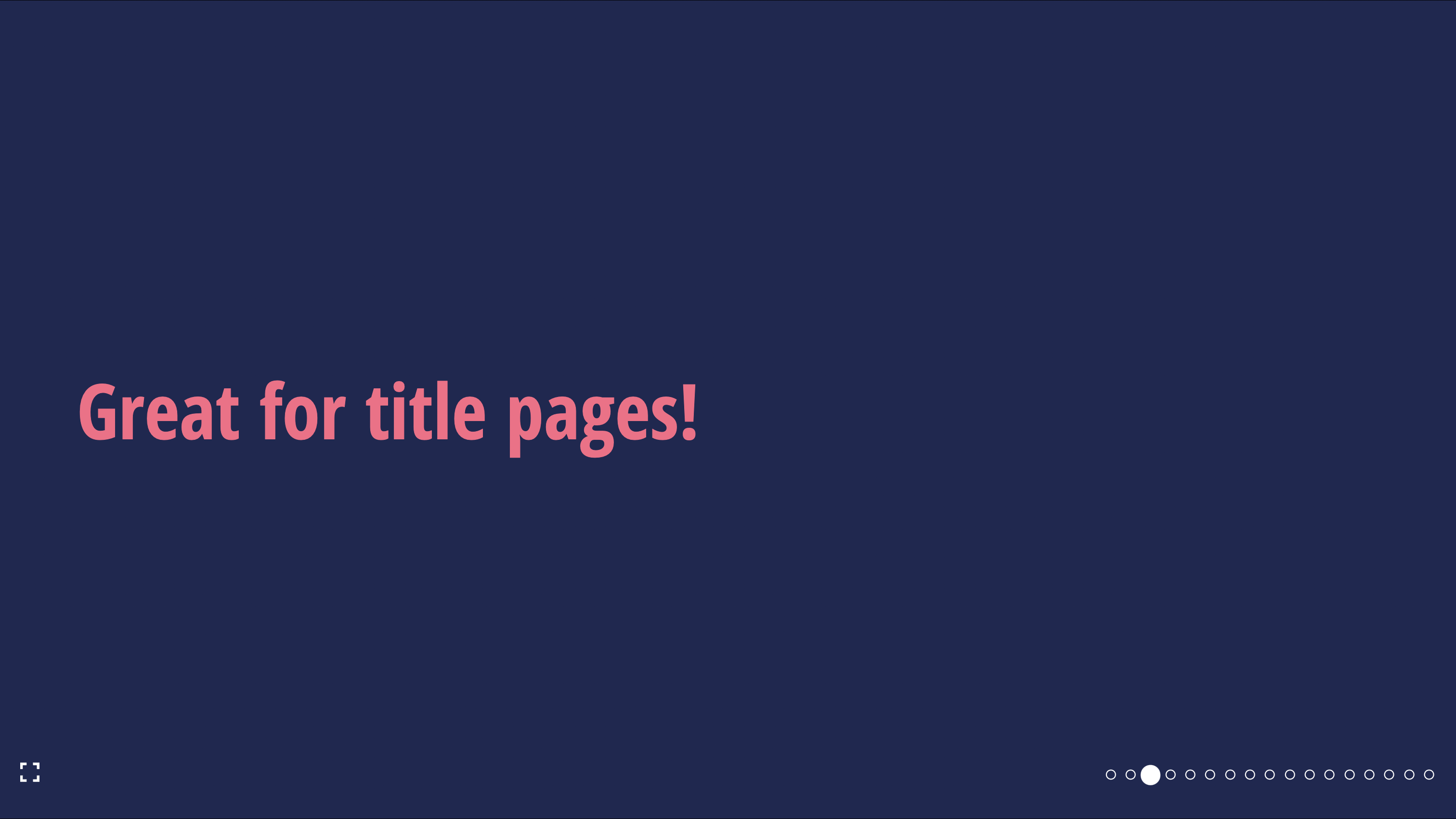
SlideLayout.Section
A layout with a section title
| Props | Type | Required | Example |
|---|---|---|---|
...slideProps | Slide Props | ❌ | |
sectionProps | Text Props | ❌ | { fontSize: "48px" } |
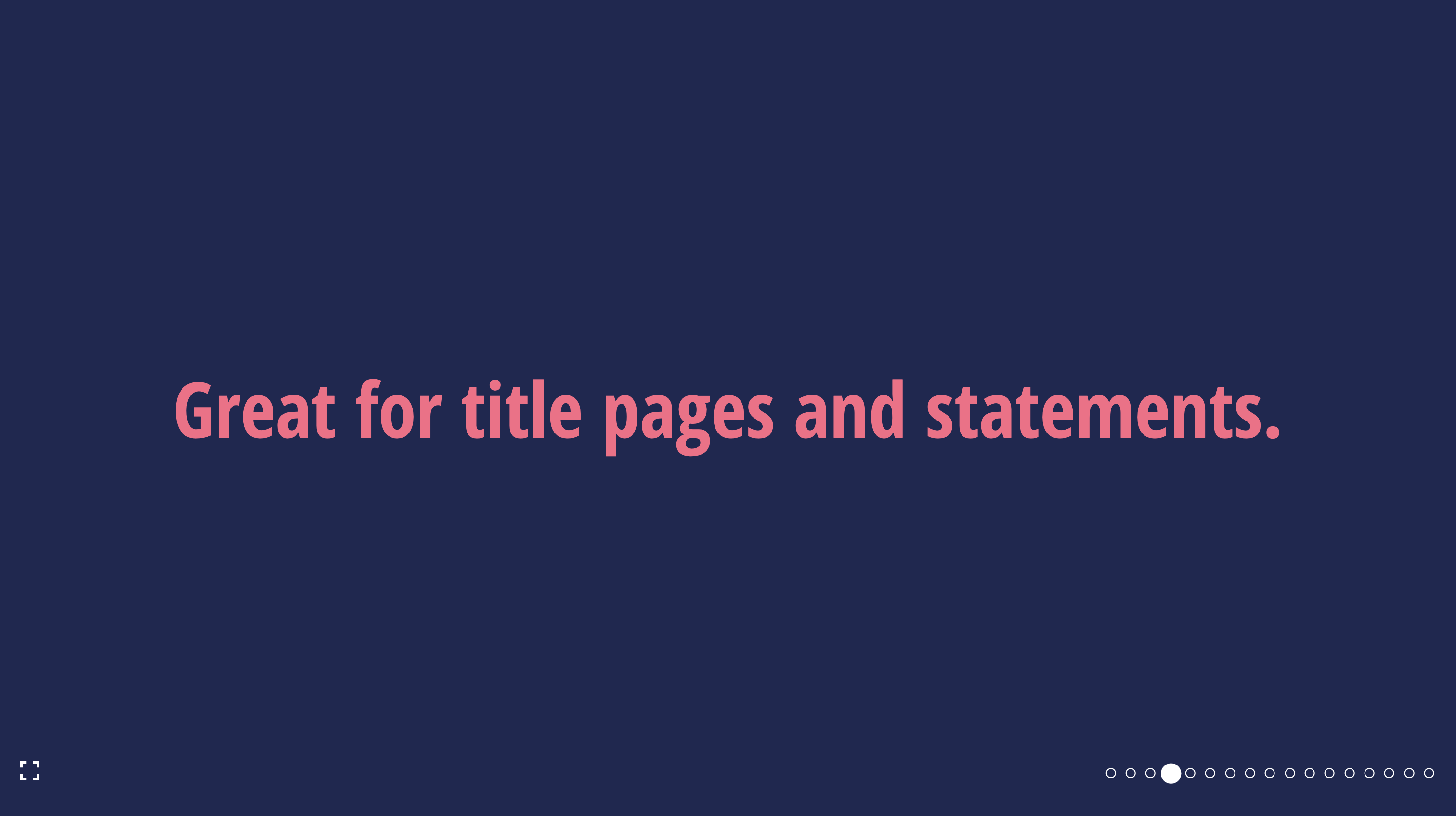
SlideLayout.Statement
A layout with a centered statement
| Props | Type | Required | Example |
|---|---|---|---|
...slideProps | Slide Props | ❌ | |
statementProps | Text Props | ❌ | { fontSize: "48px" } |
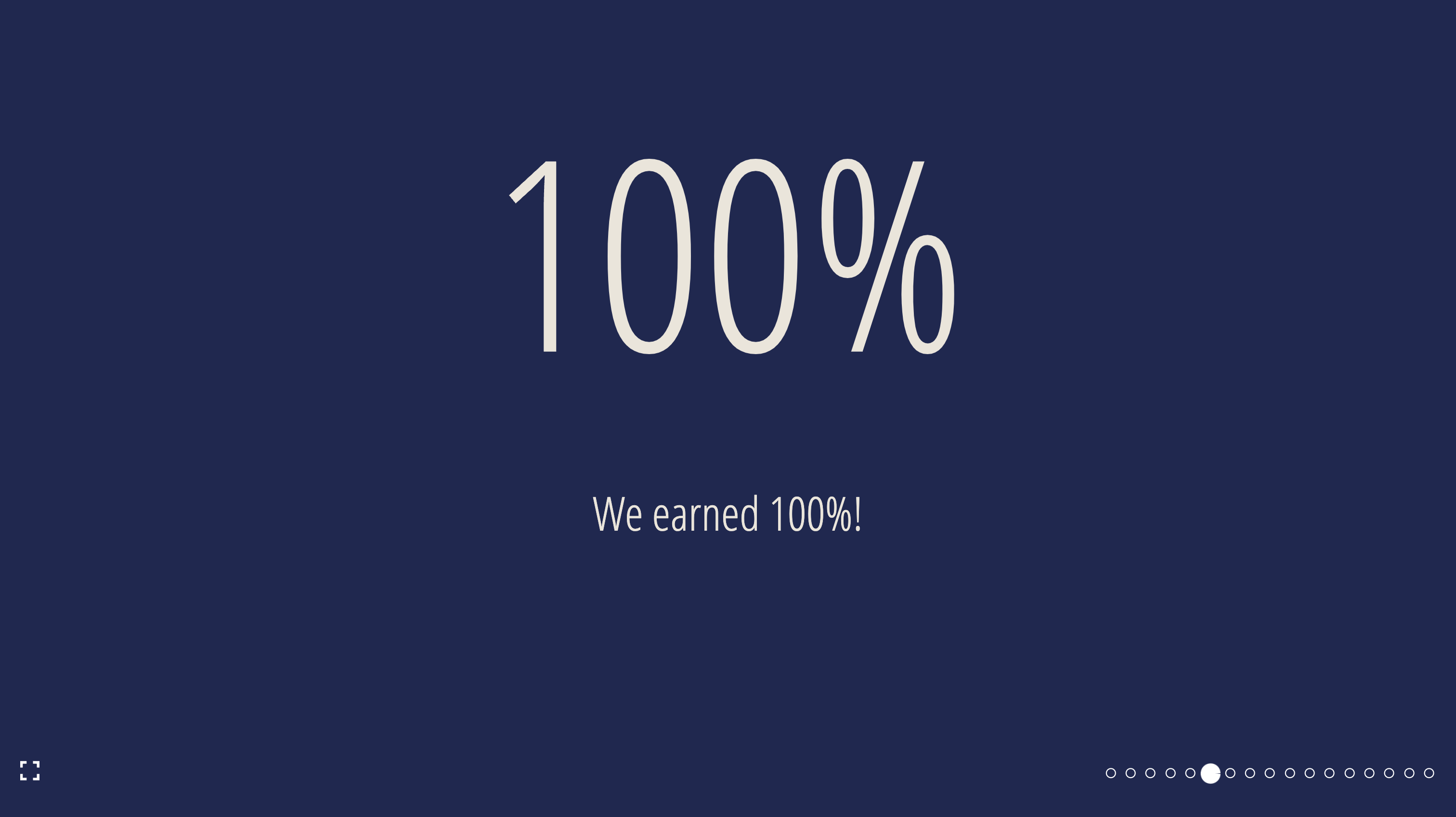
SlideLayout.BigFact
A layout to present a fact in large font
| Props | Type | Required | Example | Default |
|---|---|---|---|---|
children | ReactNode | ✅ | 100% | |
...slideProps | Slide Props | ❌ | ||
factInformation | ReactNode | ❌ | Fact information | |
factProps | Text Props | ❌ | { fontSize: "100px" } | |
factInformationProps | Text Props | ❌ | { fontSize: "48px" } | |
factFontSize | string | ❌ | 150px | 250px |
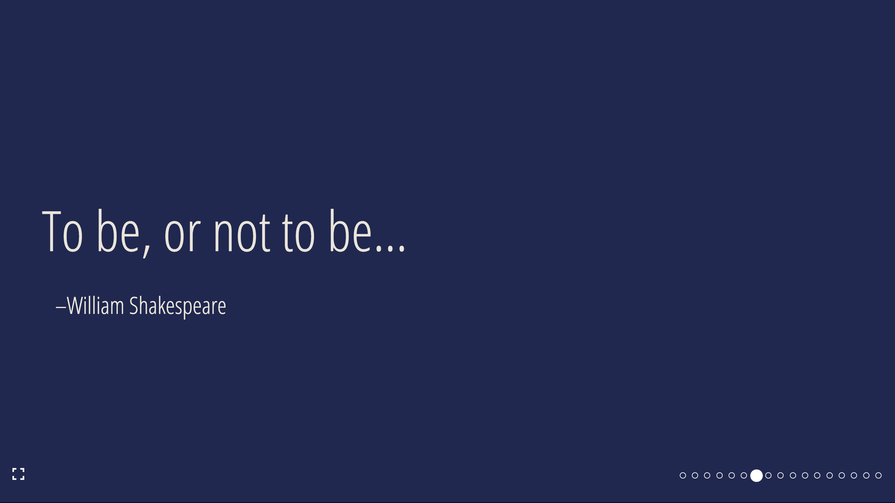
SlideLayout.Quote
A quote and attribution layout
| Props | Type | Required | Example |
|---|---|---|---|
...slideProps | Slide Props | ❌ | |
children | ReactNode | ✅ | To be, or not to be |
attribution | ReactNode | ✅ | William Shakespeare |
quoteProps | Text Props | ❌ | { fontSize: "100px" } |
attributionProps | Text Props | ❌ | { fontSize: "48px" } |

SlideLayout.Code
A layout with a single code pane and an optional title
| Props | Type | Required | Example |
|---|---|---|---|
...slideProps | Slide Props | ❌ | |
children | string | ✅ | const Component = (props: componentProps): JSX.Element = {...} |
language | boolean | ✅ | false |
title | string | ❌ | Show me the code! |
titleProps | Heading Props | ❌ | { color: 'red' } |
codePaneProps | CodePaneProps | ❌ |
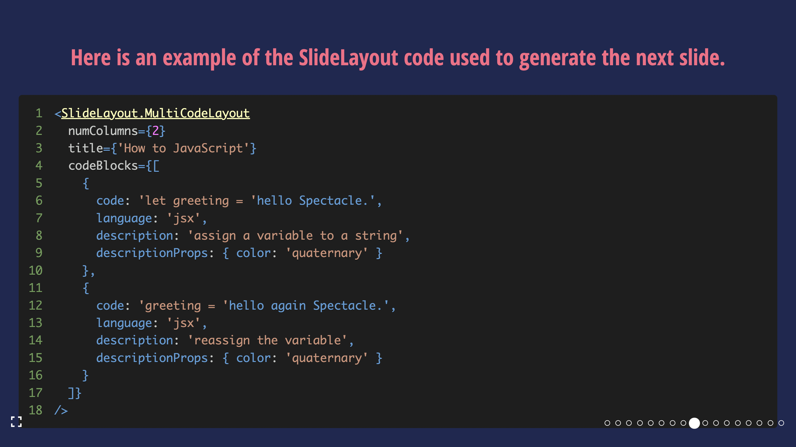
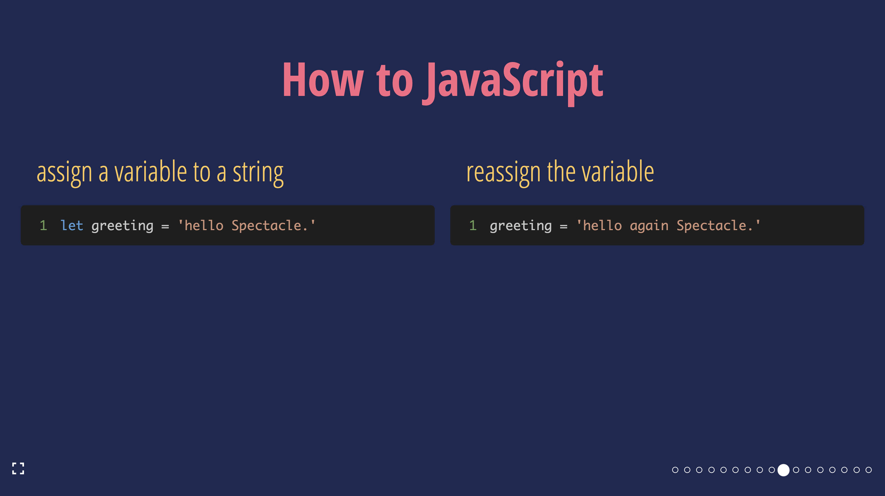
SlideLayout.MultiCodeLayout
A layout with more than one code block: multiple code panes with optional descriptions, and an optional slide title.
| Props | Type | Required | Example |
|---|---|---|---|
...slideProps | Slide Props | ❌ | |
codeBlocks | CodeBlock[] | ✅ | [{ code: 'console.log("hello world!")', language: 'jsx', description: 'Say hello', codePaneProps: {...} }, {...}] |
title | string | ❌ | Show me the code! |
titleProps | Heading Props | ❌ | { color: 'red' } |
numColumns | number | ❌ | {2} |
where
type CodeBlock = Omit<CodePaneProps, 'children'> & {
  code: CodePaneProps['children'];
  description?: string | ReactNode;
  descriptionProps?: ComponentProps<typeof Text>;
}
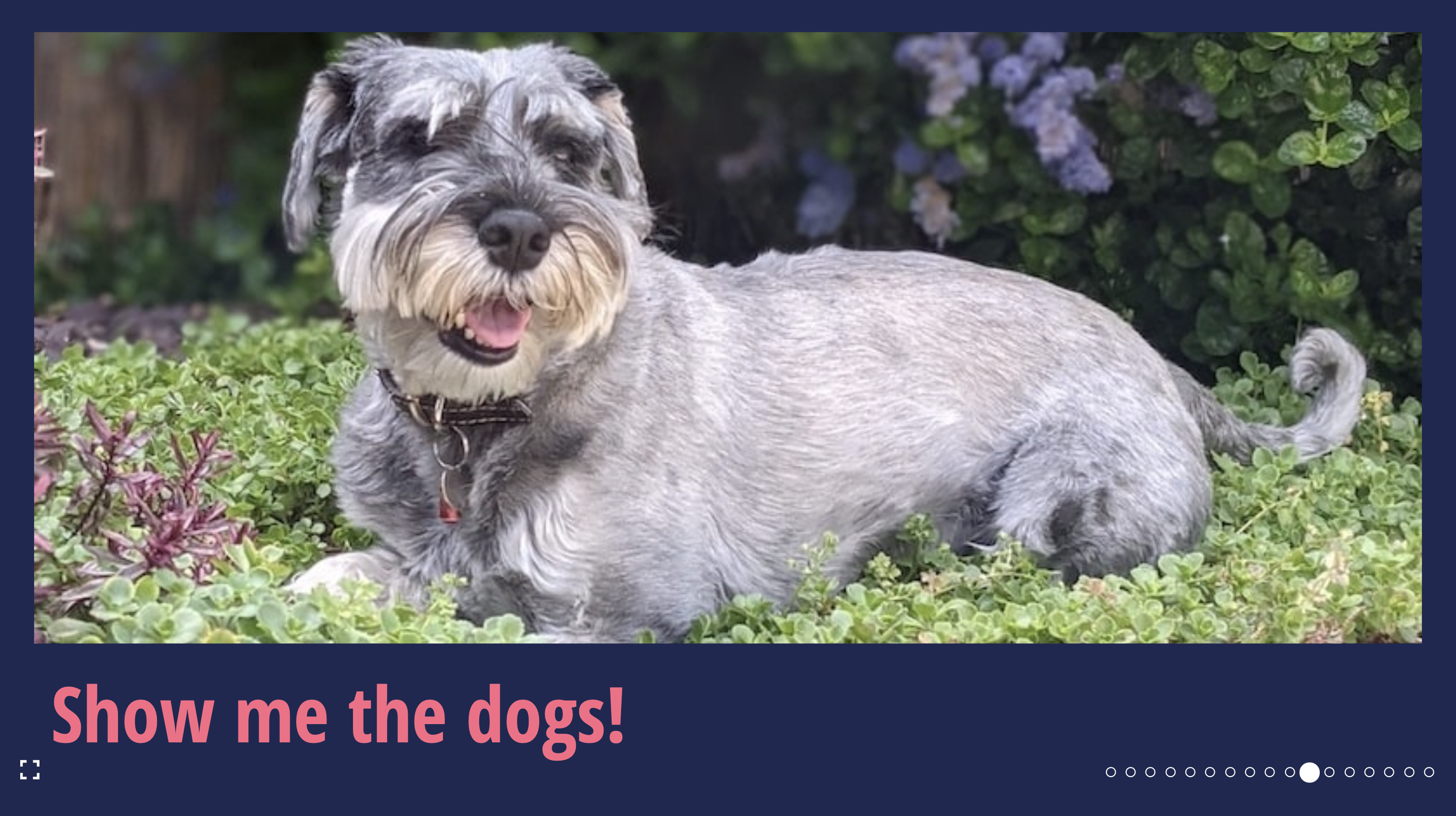
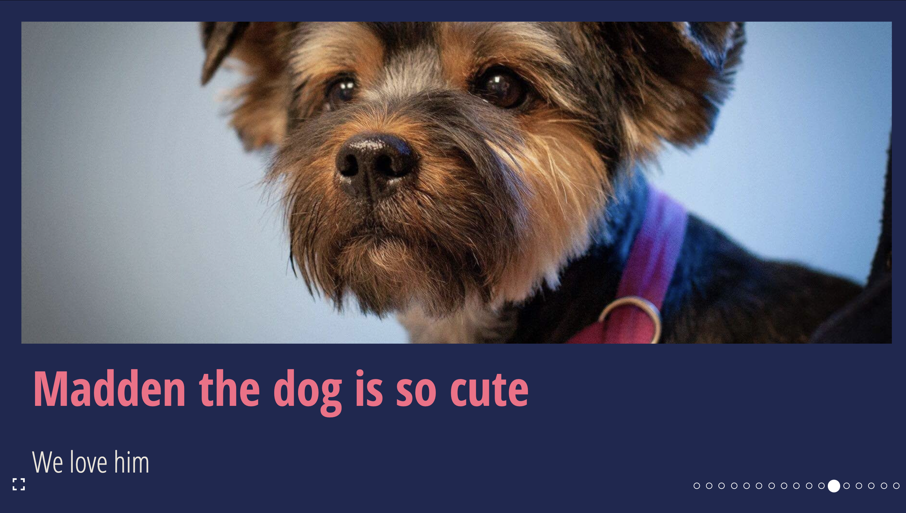
SlideLayout.HorizontalImage
A layout with one image per slide: a horizontal/landscape image and an optional title or description.
| Props | Type | Required | Example |
|---|---|---|---|
...slideProps | Slide Props | ❌ | |
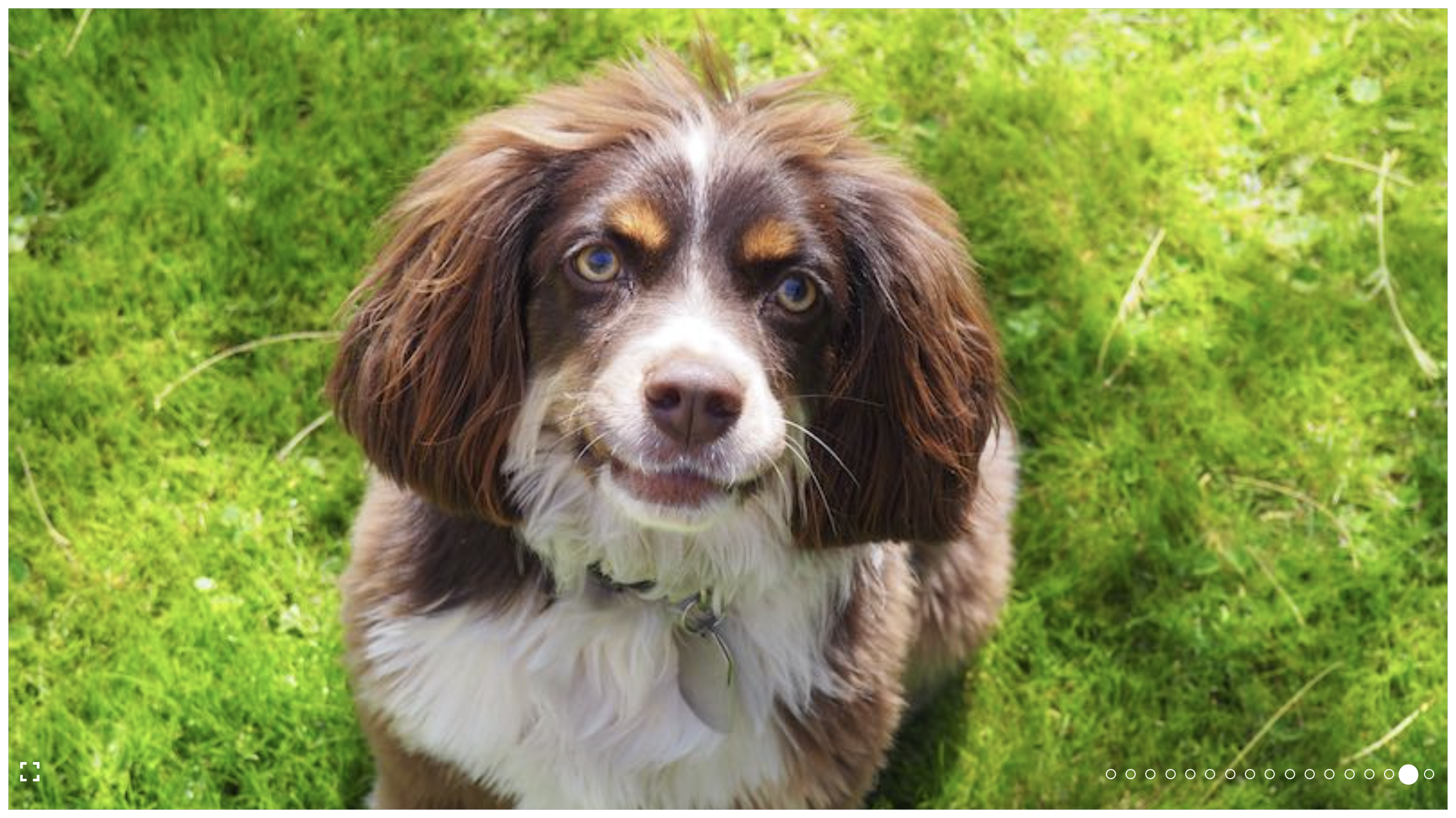
src | string | ✅ | https://raw.githubusercontent.com/FormidableLabs/dogs/main/src/fred.jpg |
alt | string | ✅ | Fred the dog looking at the camera |
imgProps | ImgHTMLAttributes<HTMLImageElement> | ❌ | { style: { objectFit: 'contain' } } |
imgContainerProps | ComponentProps<typeof FlexBox> | ❌ | { style: { border: '8px solid white' } } |
title | string \| ReactNode | ❌ | Fred is a 100% pure bred good boy! |
titleProps | Text Props | ❌ | { color: 'red' } |
description | string \| ReactNode | ❌ | and we love him |
descriptionProps | Text Props | ❌ | { color: 'white' } |
objectFit | React.CSSProperties['objectFit'] | ❌ | cover |
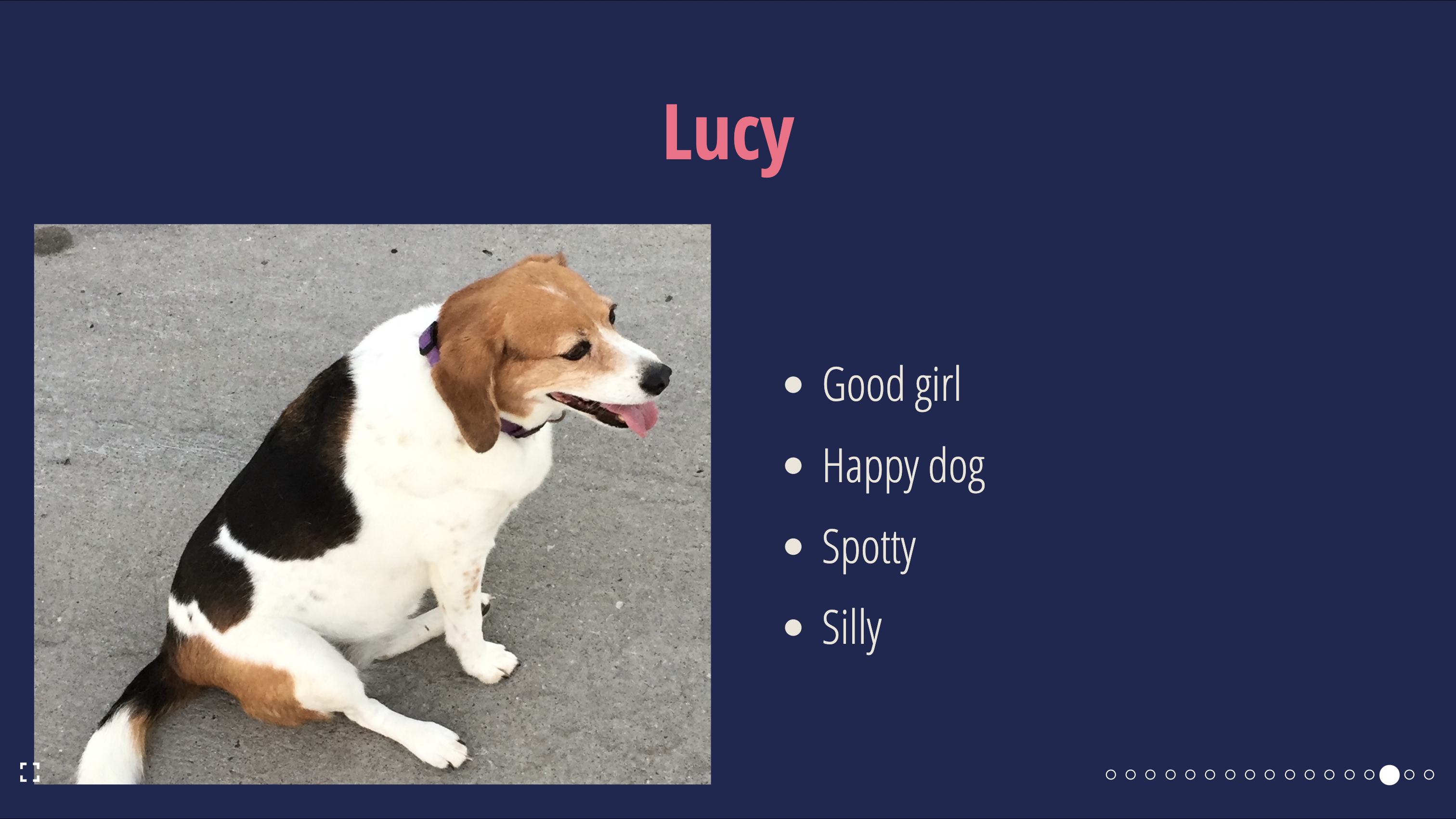
SlideLayout.VerticalImage
A layout with one image per slide: a vertical/portrait image with a bulleted list and an optional title.
| Props | Type | Required | Example |
|---|---|---|---|
...slideProps | Slide Props | ❌ | |
src | string | ✅ | https://raw.githubusercontent.com/FormidableLabs/dogs/main/src/fred.jpg |
alt | string | ✅ | Fred the dog looking at the camera |
imgProps | ImgHTMLAttributes<HTMLImageElement> | ❌ | { style: { objectFit: 'contain' } } |
imgContainerProps | ComponentProps<typeof FlexBox> | ❌ | { style: { border: '8px solid white' } } |
position | right | left | ❌ | right |
title | string \| ReactNode | ❌ | Fred is a 100% pure bred good boy! |
titleProps | Text Props | ❌ | { color: 'red' } |
listItems | ReactNode[] | ❌ | ['brown hair', 'brown eyes', 'happy boy'] |
animateListItems | boolean | ❌ | true |
listType | ordered | unordered | ❌ | unordered |
listProps | ComponentProps<typeof UnorderedList & typeof OrderedList> | ❌ | { color: 'white' } |
objectFit | React.CSSProperties['objectFit'] | ❌ | cover |
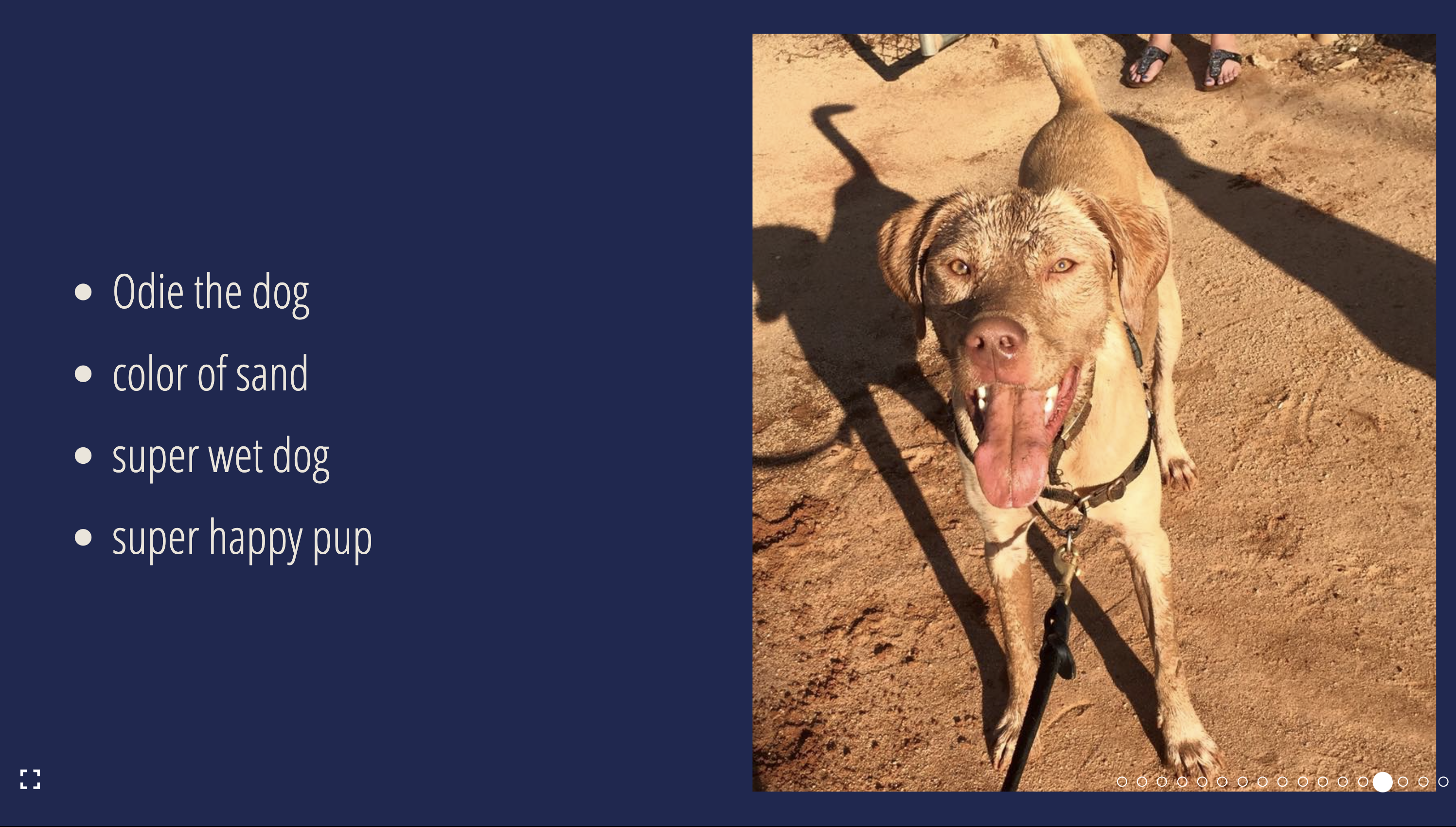
SlideLayout.ThreeUpImage
A layout with three images per slide: a primary, a top and bottom images.
| Props | Type | Required | Example |
|---|---|---|---|
...slideProps | Slide Props | ❌ | |
primary | ImagePane & { position?: 'right' \| 'left'; } | ✅ | {src: 'https://raw.githubusercontent.com/FormidableLabs/dogs/main/src/fred.jpg', alt: 'Fred the dog looking at the camera' } |
top | ImagePane | ✅ | {src: 'https://raw.githubusercontent.com/FormidableLabs/dogs/main/src/fred.jpg', alt: 'Fred the dog looking at the camera' } |
bottom | ImagePane | ✅ | {src: 'https://raw.githubusercontent.com/FormidableLabs/dogs/main/src/fred.jpg', alt: 'Fred the dog looking at the camera' } |
where
type ImagePane = {
  src: string;
  alt: string;
  imgProps?: React.ImgHTMLAttributes<HTMLImageElement>;
  imgContainerProps?: ComponentProps<typeof FlexBox>;
  objectFit?: React.CSSProperties['objectFit'];
}

SlideLayout.FullBleedImage
A layout with an image that covers the entire slide.
| Props | Type | Required | Example |
|---|---|---|---|
...slideProps | Slide Props | ❌ | |
src | string | ✅ | https://raw.githubusercontent.com/FormidableLabs/dogs/main/src/fred.jpg |
alt | string | ✅ | Fred the dog looking at the camera |
imgProps | ImgHTMLAttributes<HTMLImageElement> | ❌ | { style: { objectFit: 'contain' } } |
imgContainerProps | ComponentProps<typeof FlexBox> | ❌ | { style: { border: '8px solid white' } } |
objectFit | React.CSSProperties['objectFit'] | ❌ | cover |